Create isofill/contourf plots
Table of Contents
The Isofill class
To create an isofill/contourf plot, one creates a base_utils.Isofill
object as the plotting method, and passes it to the base_utils.Plot2D
constructor or the base_utils.plot2() function.
Define the contour levels
One key element of a good isofill/contourf plot is a set of appropriately
chosen contour levels. There are basically 2 ways to define the contour levels
in base_utils.Isofill:
1. Automatically derive from input data, and a given number of levels
Your data may come with various orders of magnitudes, and sometimes it can be a bit tricky (and annoying) to manually craft the contour levels for each and every plot you create, particularly when you just want to have a quick read of the data. The 1st approach comes as handy for such cases.
To automatically derive the contour levels, these input arguments to the
constructor of base_utils.Isofill are relevant:
vars: input data array(s).The 1st and only mandatory input argument is
vars, which is the inputndarray, or a list of arrays to be plotted. This is used to determine the value range of the input data. Missing values (masked ornan) are omitted.The list input form is useful when one wants to use the same set of contour levels to plot multiple pieces of data.
num: the desired number of contour levels.Note that in order to derive nice-looking numbers in the contour levels, the resultant number may be sightly different.
What is meant by “nice-looking” is that the contour level values won’t be some floating point numbers with 5+ decimal places, like what one would get using, for instance
>>> np.linspace(0, 30, 12)
array([ 0.        ,  2.72727273,  5.45454545,  8.18181818, 10.90909091,
       13.63636364, 16.36363636, 19.09090909, 21.81818182, 24.54545455,
       27.27272727, 30.        ])
Instead,
base_utils.Isofillwould suggest something like this:[0.0, 2.5, 5.0, 7.5, 10.0, 12.5, 15.0, 17.5, 20.0, 22.5, 25.0, 27.5, 30.0]
zero: whether0is allowed to be one contour level.zero = 0exerts no inference on the inclusion of0.zero = -1prevents the number0from being included in the contour levels, instead, there would be a 0-crossing contour interval, e.g.[-2, 2], that represent the 0-level with a range.This is very helpful in plots with a divergent colormap, e.g.
plt.cm.RdBu. Your plot will have a white contour interval, rather than just various shades of blues and reds. The white area represents a kind of buffer zone in which the difference is not far from 0, and the plot will almost always end up being cleaner.min_level,max_level,ql,qr: determine the lower and upper bounds of the data range to plot.min_levelandmax_levelare used to specify the absolute bounds. IfNone(the default), these are taken from the minimum and maximum values fromvars.qlandqrare used to specify by relative bounds:qlfor the left quantile andqrfor the right quantile. E.g.ql = 0.01takes the0.01left quantile as the lower bound, andqr = 0.05takes the 0.95 quantile as the upper bound. These are useful for preventing some outliers from inflating the colorbar.If both
qlandmin_levelare given, whichever gives a greater absolute value is chosen as the lower bound. Similarly forqrandmax_level.Note
In order to arrive at nice-looking contour level numbers, the resultant bounds may not be exactly as requested.
If the lower/upper bound does not cover the entire data range, an extension on the relevant side is activated:
self.ext_1 = True if self.data_min < vmin else False
self.ext_2 = True if self.data_max > vmax else False
These will be visually represented as an overflow on the colorbar.
2. Manually specify the contour levels.
Manual contour levels are simply specified by the levels keyword argument:
iso = Isofill(var, 10, levels=np.arange(-10, 12, 2))
This will override the effects from all the arguments listed in the above section, except that overflows will still be added, if your specified levels do not cover the entire data range.
Choose the colormap
The colormap is specified using the cmap argument, which is default to
a blue-white-red divergent colormap plt.cm.RdBu_r.
To use a different colormap, provide one from the matplotlib’s
colormap collection, e.g. cmap = plt.cm.rainbow. It is possible to give
only the name of the colormap as a string: cmap = 'rainbow'.
Split the colormap colors
Divergent colormaps are commonly used in academic works. The
plt.cm.RdBu_r colormap is one such example, with a transition from
dark blue (the minimum) to white in the middle, and to dark red (the
maximum) on the right.
The middle color (white in this case) usually corresponds to some critical transition in the data (e.g. going from negative to positive), therefore it is crucial to make sure they are aligned up. See an example:
import matplotlib.pyplot as plt
import gplot
from gplot.lib import netcdf4_utils

# read in SST data
var2 = netcdf4_utils.readData('sst')
lats = netcdf4_utils.readData('latitude')
lons = netcdf4_utils.readData('longitude')

var2ano=var2-280.  # create some negative values

figure, axes = plt.subplots(figsize=(12, 10), nrows=2, ncols=2,
        constrained_layout=True)

iso1=gplot.Isofill(var2ano, num=11, zero=1, split=0)
gplot.plot2(var2ano, iso1, axes.flat[0], legend='local',
        title='negatives and positives, split=0')

iso2=gplot.Isofill(var2ano, num=11, zero=1, split=1)
gplot.plot2(var2ano, iso2, axes.flat[1], legend='local',
        title='negatives and positives, split=1')

iso3=gplot.Isofill(var2ano, num=11, zero=1, split=2)
gplot.plot2(var2ano, iso3, axes.flat[2], legend='local',
        title='negatives and positives, split=2')

iso4=gplot.Isofill(var2, num=11, zero=1, split=2)
gplot.plot2(var2, iso4, axes.flat[3], legend='local',
        title='all positive, split=2')

figure.show()
figure.tight_layout()
The output is given in Fig.3 below:
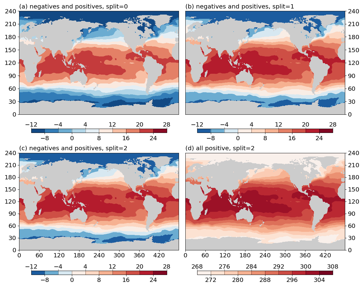
Fig. 3 Effects of the split argument.
(a) do not split the colormap for data with negative and positive values (split=0).
(b) split the colormap if data have both negative and positive values (split=1).
(c) force split the colormap when data have both negative and positive values (split=2).
(c) force split the colormap when data have only positive values (split=2).
To summarize:
split=0: do not split the colormap.split=1: split the colormap if data have both positive and negative values. Do not split if data have only negative or only positive values.split=2: force split. If the data have both positive and negative values, the effect is the same assplit=1. If data have only positive (negative) values, will only use the right (left) half of the colormap.
Note
Positive v.s. negative is one way of splitting the data range into 2 halves,
at the dividing value of 0.
It is possible to use an arbitray dividing value, by using the vcenter argument.
E.g. iso = gplot.Isofill(var, num=10, split=2, vcenter=10)
Overlay with stroke
It is possible to stroke the isofill/contourf levels with a layer of thin contour lines. E.g.
import matplotlib.pyplot as plt
import gplot
from gplot.lib import netcdf4_utils

# read in SLP data
var1 = netcdf4_utils.readData('msl')
lats = netcdf4_utils.readData('latitude')
lons = netcdf4_utils.readData('longitude')

figure, (ax1, ax2) = plt.subplots(figsize=(12, 5), nrows=1, ncols=2,
        constrained_layout=True)

iso1 = gplot.Isofill(var1)
gplot.plot2(var1, iso1, ax1, title='Basemap isofill without stroke',
            projection='cyl')

iso2 = gplot.Isofill(var1, stroke=True)
gplot.plot2(var1, iso2, ax2, title='Basemap isofill with stroke',
            projection='cyl')
figure.show()
The result is given in Fig.4 below:
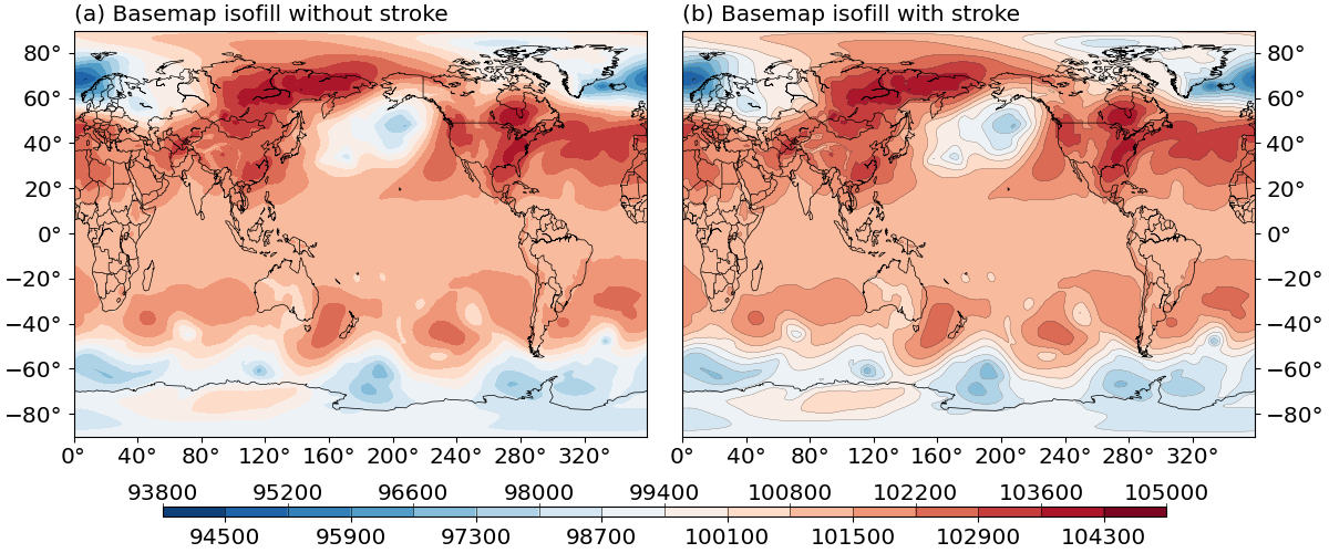
Fig. 4 Effects of the stroke argument.
(a) isofill plot without stroke.
(b) isofill plot with stroke.
stroke is set to False by default. To further control the line width of
the stroke, use the stroke_lw argument, which is default to 0.2.
The line color is default to a grey color (stroke_color = 0.3), and line style
default to solid (stroke_linestyle = '-').
The mappable object
gplot calls matplotlib’s (or basemap’s, if it is using Plot2Basemap)
contourf() function under the hood. The function returns a mappable object,
e.g. cs = plt.contourf(data). This mappable object is stored as
an attribute of the base_utils.Plot2D (or
basemap_utils.Plot2Basemap) object:
>>> pobj = Plot2Basemap(var, iso, lons, lats, ax=ax)
>>> pobj.plot()
>>> pobj.cs
<matplotlib.contour.QuadContourSet object at 0x7f0e3e6b4550>
The same plotobj is returned by the base_utils.plot2() function, therefore,
the mappable object can be retrieved using:
>>> pobj = gplot.plot2(var, iso, ax, xarray=lons, yarray=lats)
>>> pobj.cs
<matplotlib.contour.QuadContourSet object at 0x7f0e3e6b4550>